Session #55: Label, Coaster and Cap Art
Running The Barley Blog is a hobby — a tasty, tasty hobby. The full time job has me fully immersed in Web design and development. As much as I enjoy coding around Internet Explorer’s faults, it’s the design aspect of my job where my heart lies. So, it’s fairly understandable that I am drawn to beer whose label art is eye catching or original.
I can’t tell you how many times I’ve written a beer review for this site that started off with my describing how the colors and lines on its label drew me to it. I’m a sucker for a good loocking label.
In trying to think through all the beer I’ve consumed in my lifetime, the following selection are those that immediately jumped to the front of my fogged cerebral cortex with the greatest of ease. The breweries below have produced and utilizes labels that are unique, attention-grabbing and/or just plain bad ass.
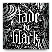
Left Hand Brewing
The very first label that came to mind is from Left Hand Brewing. Their Fade To Black series has produced some tasty beer, but also one of the more mesmerizing labels I’ve seen in quite some time. Though, Left Hand’s label artwork isn’t always all that stellar the did follow up the FTB series with the terrifically designed and colorful label for Good Juju.
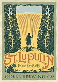
Odell Brewing
A relatively new-to-me brewery that has some interesting art work adorning their product is Odell Brewing out of Colorado. With a style that is similar to Left Hand’s Good Juju, Odell’s Double Pilsner is not only a tasty brew, but one that also has some great art on its label, not to mention the use of typography that matches well. The brewery’s Woodcut #5 doesn’t have an outrageous label, but it’s refined nature fits the beer wonderfully.
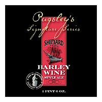
Shipyard Brewing
Maine’s Shipyard Brewing has always had decent label art (Old Thumper, Blue Fin Stout), but it’s the brewery’s Pugsley’s Signature Series that really stands out for me. The artwork isn’t intricate or wild, but it’s stately, yet simple layout and use of color (across the series) is head and shoulders above many of their peers. From the red of the Shipyard Imperial Porter to the vibrant blue of the wonderfully tasty Smashed Blueberry, Shipyard Brewing has maintained the minimalist and upscale design that fits the product quite well.
Honorable Mention
There are so many more wonderfully designed labels out there that I am sure I have missed. Here are a few other that come to mind:
- Anything by Flying Dog Brewing, but more recently their Table for Two
- The wild colors that Narragansett chooses for their cans. For instance Narragansett Fest
- More can design from Crow Peak: Pile O’ Dirt Porter
- The great art on Iron Hill’s Winter Wheat Wine-Oh!
Like I said, there is so much more amazingly designed and packaged beer that I missed, that one could probably build a whole blog solely to showcase it alone. Hmmm… I wonder…